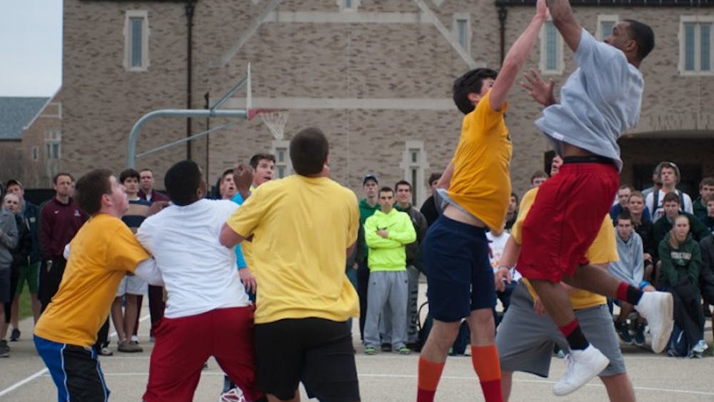
Whether it’s to relive glory days on the court, pitch or gridiron, or it’s to live vicariously through others, sports fans love to wear the jersey of their favorite team or athlete.
A lot goes into a good jersey, but I think we can all agree the two main ingredients are the design (the team logo, trim, color scheme and number style) and comfortability of the uniform.
Consider this Sports Authority a two-parter, with this first installment addressing the best designed jerseys among professional sports teams. Now without further ado…
Honorable Mention — MLS Jerseys
I hate to do it, but I just can’t put any soccer uniforms on here. When you sell your soul (and the primary image on your jersey) to advertisers for a quick buck, you lose a lot in my esteem. The New York Red Bulls are LITERALLY named for the energy drink. I would be remiss though if I didn’t at least acknowledge their logo still looks good, as do the Seattle Sounders’ with “XBOX” on them. But again, show off your own original name with pride on the front of the jersey if you want in my rankings.
9. Baltimore Ravens
I’m going to throw NFL fans a bone here because, spoiler alert, this is the only football team on this list. I hate to do it to the rest of the league, but let’s be real, the helmet does way too much of the heavy lifting, and those deserve their own ranking altogether.
There’s no logo of significant size on the actual jerseys, but Baltimore has a unique color scheme (not many purple teams in professional sports), sharp numbers and, while birds are overused as mascots, a raven is a seldom-seen pro sports nickname. Thank you, Edgar Allen Poe.
8. New York Yankees
I’m sure this already has people fuming. Say what you will about New York sports teams or the city in general, but those pinstripes are iconic. They’re so iconic that Notre Dame football didn't think twice about making some REALLY funky uniforms with pinstripes on their pants and shoulders.
7. San Antonio Spurs
People sleep on the Spurs for a variety of reasons, not the least of which, I feel like, is due to their uniforms. Black, white and grey just don’t pop like the Lakers’ purple and gold or Celtics’ green. But the design is economic, the nickname unique and the logo variable enough to serve as the “u” in “Spurs” or as the sole image on the jersey; it’s also one of the few logos that can survive the constant attrition the NBA puts jerseys through.
6. St. Louis Cardinals
To be honest, baseball is pretty much the antithesis of the NBA when it comes to jerseys. The league doesn’t have a lot of variation. Heck, even the Red Sox logo doesn’t serve as the primary image on their jerseys. If it did, I’d put them on here in a heartbeat. But I digress…
I know what I said about birds being overused as mascots, but I have to hand it to St. Louis, they have some good-looking teams. Given the lack of variation, a couple of cardinals sitting on a baseball bat as if it’s a branch seems pretty good (relatively speaking). Plus, the logo still looks good regardless of if the jersey is red, black or light blue.
5. Milwaukee Bucks
This may be a hot take, but I think Milwaukee has some nice unis. I’m not a huge fan of what the NBA has done with (most of) their new designs of uniforms, but like the Spurs, I think the Bucks make a lot happen without a lot of pageantry.
Again, like the Spurs and Ravens, it’s rare to see a buck as a mascot. Put it in the middle of a jersey with a number right in the middle of the antlers and it looks pretty good. That hunter green color also goes well with their secondary colors, even cream. That said, I ‘m not totally sure how to feel about their “Cream City” jerseys. Cool…?
4. St. Louis Blues
Like I said, there are some good-looking teams in St. Louis. And I’m going to be honest, I think the NHL has the most depth in terms of quality uniform design. And as for this one, sure, it may be a pretty big primary image, but that logo just appeals to me for some reason. I can’t really explain why this appeals to me more than, say, the NBA’s Utah Jazz. Both are named for music and have a musical note as the symbol. I don’t necessarily think wings on that note are better than a basketball drawn within it.
Maybe it’s the Jazz’s unruly color scheme — because yellow, orange, red, navy and green is all a bit much, even when spread out over several jerseys. Maybe it’s the fact that their mascot is now out of place (seeing as the franchise started in New Orleans but didn’t have the decency to pick something more appropriate than Jazz for the Mormon capital of the world). Again though, I digress…
In any case, the Blues earn a little more cache for standing out in a crowded field of nice threads. The size of their logo is OK since that’s the only thing on the front. Plus, blue, black and yellow look awfully good on that jersey. Blue, yellow and red on the alternates isn’t too shabby either.
3. Pittsburgh Penguins
The city of Pittsburgh should probably get a bit more creative with colors aside from black and yellow, but it seems to be working well enough for them. A lot of the credit here goes to the fact that a penguin is a perfect hockey mascot, and it manages to look competitive (as opposed to adorable) as the image on their jerseys. I can’t really explain why, but the triangle in the background is a very nice touch.
2. Vancouver Canucks
A few things go into this. One is the blue and green color scheme, with red and blue alternates. Plus, the design still manages to stick out in a crowded field of nice jerseys. More than anything though, I respect the team and national pride.
For one thing, not a lot of NHL jerseys have the name of their city on there, so putting Vancouver on the front is a great start. However, the real deciding factor is that, with the stereotype of Canadians being overly polite, they Yankee-Doodle-Dandy'd the word “Canuck,” stuck a shark on their jersey and said, “Come get some, eh.” And you know they can back it up, because they’re Canadians, and every Canadian comes out of the womb on ice skates and picks up a hockey stick before they speak their first words (I kid, Canucks; please don't beat me up).
1. Miami Heat
This wasn’t as tough as you may think. I bet this is a real hot (no pun intended) take to some people, especially because, while the red and black is sick in its own right, I’m actually a big fan of the “Miami Vice” jerseys. Say what you will, but the franchise and fans really bought into going from red and black to PINK and BABY BLUE.
That’s a combination you never see, but it looks good on their jerseys and court, especially with a script font that manages to differentiate itself from other frequently used script names. Breast cancer awareness is just a bonus.
This may or may not be the most controversial piece I have ever written, but it doesn’t end here. Stay tuned for the second installment of this series, where I’ll rank which sports have the best-made uniforms in terms of comfortability. To be continued…


