As universities across the country opened for the first time since March, many implemented significant changes to reduce the potential spread of COVID-19 on campus. One such tool many schools developed was a COVID-19 dashboard, which aim to track coronavirus cases on a particular campus.
We Rate COVID Dashboards works to evaluate just how meaningful those dashboards are. Their team of professors and students from universities across the country has rated over 200 university dashboards on a letter scale from D to A++.
An ideal dashboard is easy to read, frequently updated and highlights detailed data on testing.
An A++, however, seems to be an elusive score. As of now, the highest rated dashboard on the site belongs to Ohio State University, which is the only dashboard with an A+.
The idea to rate university dashboards sprung from a belief that universities should be open and transparent about coronavirus cases as students return to campus said Cary Gross, professor of medicine and public health at Yale. Gross is one of the founders of We Rate COVID Dashboards, along with Dr. Howard P. Forman, professor of diagnostic radiology, public health, economics and management at Yale.
However, they wanted to get diverse perspectives on the best way to evaluate dashboards, Gross said.
The two turned to Twitter to gauge what the public seemed to think was most important in a dashboard. Gross said they got a large amount of feedback, including a many requests to rate particular dashboards.
Gross and Forman formed a group of professors and students from universities around the country in order to gain a full perspective when rating school dashboards. From there, the website was born.
Ayotomiwa Ojo, a medical student at Harvard, said she has worked with Forman for some time, and when she expressed an interest in the project, he invited her to join.
“I was intrigued about thinking how comprehensive universities are being,” Ojo said. “Are they giving the whole picture?”
When rating dashboards, the team tries to keep in mind three groups, comprised of those either most likely to be affected or potentially forgotten: students, faculty and staff, and the surrounding community, Gross said.
“In certain towns, colleges are bringing in these students from all over the world, and it’s really important for colleges to have an understanding of what the COVID rate outside their campus walls are,” he said.
The rating system then considers all of the factors these groups should know to give out a score, Ojo said. While they consider a variety of dashboard functions, she said there is always room to improve.
“It’s difficult to read from a dashboard how the university is actually doing in implementing their plans,” she said. “Like, yes, we give them points if they tell how many tests are conducted, but we don’t evaluate if they are actually doing enough tests.”
Regardless, Ojo said, the site is a good tool for any community member to assess the COVID situation in their area.
Yet the site’s goal does not stop at simply giving out a grade. Ultimately, Gross said, they want ratings to encourage universities to revisit and improve their dashboards.
This may come from peer pressure — simply seeing that other universities are doing better may push a school to revamp its dashboard. Gross said the team is also hoping state health departments will see ratings and, potentially, set a baseline criteria for university dashboards. He also cited the power that students hold in pushing for change.
“We try to link the student newspapers when we rank each school,” Gross said. “Students have a lot of power, and I think students often under appreciate how much power they have within an institution. If we can engage some students to advocate from within, that’s another way to improve.”
So far, their hopes are being fulfilled. Gross said some universities are reaching out to ask why they received a certain score. Forty schools have even redone their dashboards and submitted them again in hopes of improving their rating.
“It’s exciting to see that some schools see our ratings and then do better,” Ojo said.
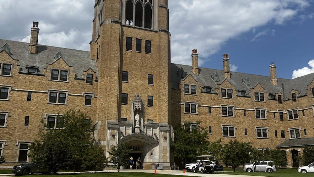
Notre Dame’s own dashboard is one of 42 to earn a B+. Not the worst, but still only the fifth-highest score a university can receive.
The Notre Dame dashboard, which is updated daily at noon, has been active since students arrived on campus at the start of the school year. It highlights estimates of active and recovered cases, the number of tests given and has an interactive graph of campus cases since Aug. 3.
When rating Notre Dame’s dashboard, Gross said “we felt [it] was off to a good start when we rated it B+. We felt that more information about the testing strategy that ND is using to keep its students safe, as well as further information about COVID status in the surrounding community, quarantine status and overall campus COVID status would also be warranted.”
Gross said the team is “looking forward to rerating the next iteration” of the University’s dashboard.
His motivation behind the project stems not only from his professional connection to public health but also has a more personal connection.
“I have two kids in two different colleges right now,” Gross said. “Frequently looking at our own kids’ dashboards also inspired me to start down this path. And one of their colleges is rated higher than the other — it’s become like a sibling rivalry.”
Whether or not the ratings cause competition, the team does hope they will change dashboards for the better.
“Our goal is not to be tongue-in-cheek and have a nice little catchy comment,” Gross said. “Our goal is to really have an impact on influencing colleges to increase the transparency of their COVID testing and mitigation efforts.”


