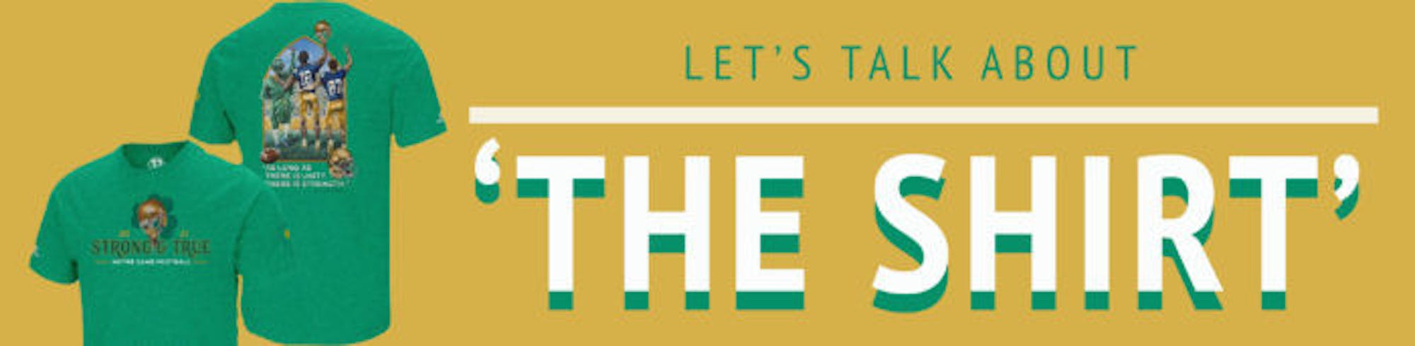
On the front, there are two images, a platitude, the name of the team and the year. On the sleeve, because of course there has to be something on the sleeve, is the insignia of “The Shirt Committee.” And on the back, there’s a quote, a football — because this is for football — a helmet and a cartoon image featuring three characters with incredibly detailed, Pixar-style, dump truck butts.“Less is more” is an approach to design which reigns supreme for good reason. We’re overwhelmed with images and text and flashing lights vying for our attention, yet simplicity often speaks louder than all the rest. Using only one image or one quote — not both and definitely not two of each — would give the shirt some much needed clarity. And on top of that, people might actually wear it more than just once.The message of this year’s shirt is unity. Nothing unites the masses like 1) cheering on people playing in a certain colored uniform and 2) spending money to buy a shirt that everyone else will be wearing. Unity is an admirable and relevant message in today’s times, but even the message of unity seems appalling to some Notre Dame fans. The same people who were outraged when the team supported its players who spoke up on racial justice and the Black Lives Matter movement are now logging onto Twitter to air their grievances with the fact that the shirt encourages unity. Once again, the deep-seated prejudices of the Notre Dame football fanbase come out into the open, this time because a shirt — well, not just any shirt, The Shirt — is too “political”or “woke” for their liking.To cap this whole discussion off, why not interrogate the idea of the shirt itself? In reality, it’s simply another cog in the machine that is the Notre Dame football industrial complex. Merchandise is the University’s favorite child — one trip to the bookstore, the most well-maintained building on campus, will reveal that — and the shirt seems to be the base of all merchandise. It’s the definition of fast fashion, a shirt designed to be mass produced, worn 12 times max and then buried at the bottom of your drawer, and it never even looks good. You could call the shirt an important Notre Dame tradition, but that would be overselling it. Notre Dame has countless traditions, too many to count, and the shirt isn’t even in the top 50.Of course, the shirt will persist; next year will no doubt bring about a new design (but this time in blue!) and thousands of unsold shirts will be dumped off at the end of the season. I know the likely ineffectiveness of this article, the “old man yells at cloud” of it all, but hopefully, ideally, maybe in my dreams, next year’s shirt will look a little cooler than this year’s.It's more than just a shirt. Check out the significance [of] The 2021 Shirt design! pic.twitter.com/syWQyAh4Zv
— The Shirt ND (@theshirtND) April 25, 2021